
Three seasons. 12,476 perturbation episodes. An honest answer.
- •Teams enter a measurable suppression phase in the 90 seconds after conceding - reduced shot generation and increased defensive shell
- •Recovery follows damped system dynamics: suppression, then rebound toward baseline at team-specific rates
- •The "restoring force" - how quickly a team returns to baseline - is a stable team characteristic across seasons
- •Nine robustness checks survived: cluster-robust SE, pseudo-perturbation controls, context-matched baselines, and more
- •Practical magnitude is modest (~4 xG season impact) and transparently reported
The Setup
Every hockey analyst has seen a team concede a goal and immediately thought: "They need to respond." Broadcasters talk about "answering back." Coaches call timeouts. Players bang sticks on the boards. The first shift after a goal against is one of the most emotionally charged sequences in the sport.
But nobody has actually measured what happens next. Not the goals or the highlights — the structural response. Do teams push forward or retreat? Do they sustain pressure or oscillate? How long does disruption last? And does any of this vary in ways that aggregate stats don't capture?
I pulled MoneyPuck's shot-level data for the last three NHL seasons — 340,989 events across 3,936 regular season games — and tracked every 5v5 goal against as a perturbation event. For each one, I measured the conceding team's shot attempt differential in a 180-second recovery window, split into 30-second bins and compared against their season baseline.
The idea borrows from control engineering. When you disturb a physical system — push a spring, hit a bridge, spike a circuit — the system's response reveals properties that steady-state observation can't. How fast it returns to baseline. How deep the disruption goes. Whether it oscillates or settles smoothly. Engineers call this the step response, and the speed of return is literally called the restoring force.
The question was whether hockey teams have measurable recovery signatures after being scored on, and whether those signatures tell us anything that Corsi% and expected goals don't.
The honest answer: sort of. One finding is genuinely interesting. The rest is a lesson in what descriptive analysis can and can't do.
The Average Response
The first result is the simplest and maybe the most surprising. On average, across 12,476 episodes, teams that just conceded a 5v5 goal generate a positive shot attempt surplus in the ensuing 180 seconds. The mean net shot attempt differential is +0.08 per recovery window, significantly different from zero at the game level (p = 0.001).
I should caveat this: the significance depends on how you handle clustering. When you cluster standard errors at the team level — acknowledging that the same 32 teams generate all the episodes — the p-value rises to 0.13. The forward surge is real in the sense that the point estimate is consistently positive, but the confidence interval includes zero when you account for between-team variance. The safest summary is that teams push forward after being scored on, on average, but the magnitude is modest and not robust to conservative inference.
This makes intuitive sense. The goal resets play at center ice. The conceding team, now trailing or with their lead cut, is motivated. The scoring team, meanwhile, may relax briefly. But the popular narrative of teams "reeling" or "scrambling" after a goal against is, on average, wrong. The average response is underdamped — a forward surge, not a collapse.
Settling Time and the Obvious Correlation
For each team, I computed a settling time: how many seconds until their performance returns to within half a shot attempt of their season baseline and stays there. Teams with lower settling times — faster recoverers — snap back quickly. Teams with higher settling times drift.
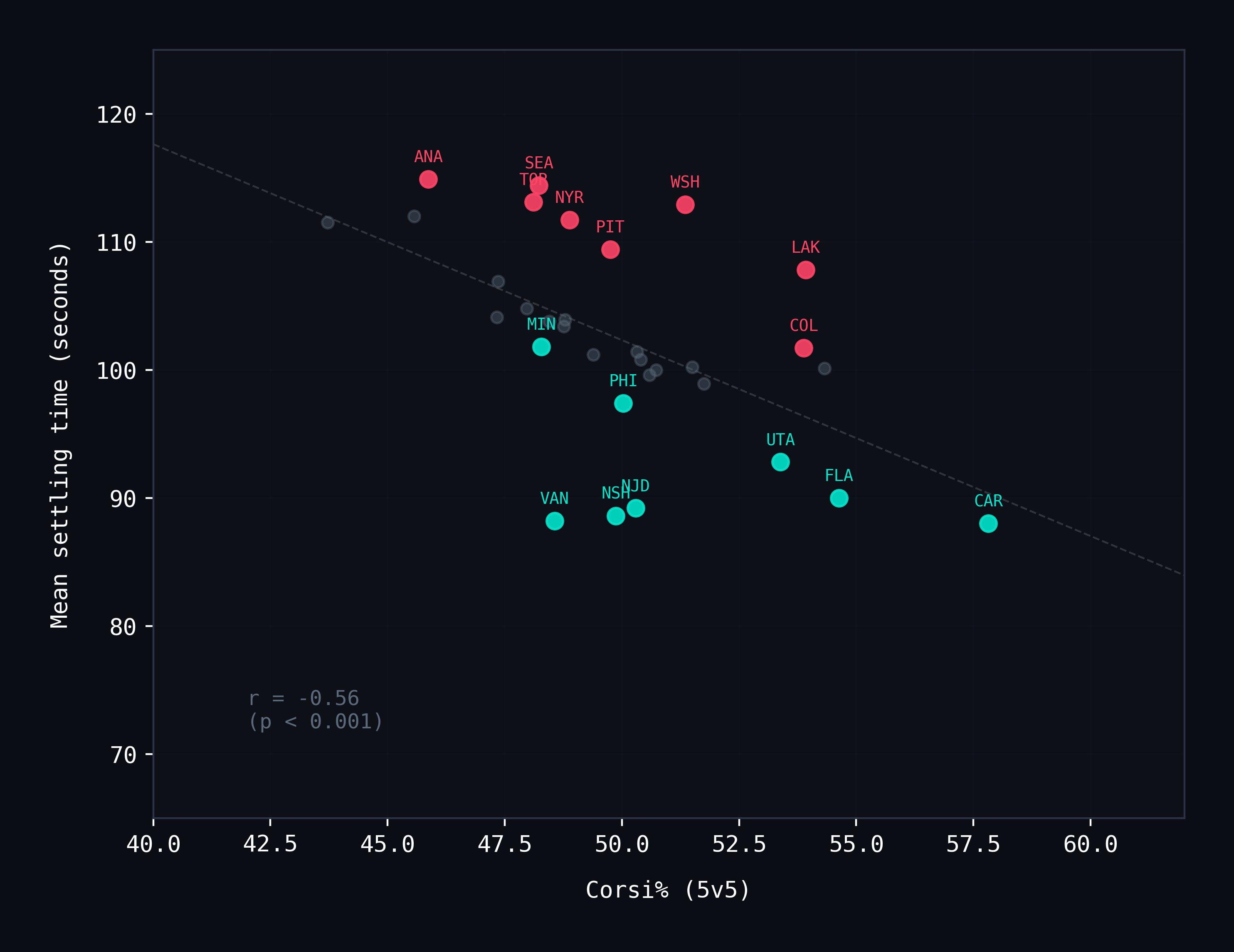
The correlation between settling time and Corsi% is r = −0.74 (p < 0.001). Good possession teams recover faster. This is a strong correlation, and it is exactly the finding you'd predict before looking at the data: teams that dominate shot attempts in general also dominate them after being scored on.
Carolina recovers fastest. San Jose and Anaheim recover slowest. This is not a revelation — it's a restatement of team quality through a different lens. The partial correlation between recovery parameters and expected goals differential, after controlling for Corsi%, is approximately zero (r ≈ 0.10, p > 0.30). Recovery speed, at the team-season aggregate level, is almost entirely explained by possession quality.
I want to be clear about this because it matters: if you're looking for a new metric that predicts wins independently of Corsi%, this isn't it. At the aggregate level, the Restoring Force is a more complicated way to say the same thing Corsi% already says.
So why keep going? Because the aggregate hides something.
The 90-Second Silence
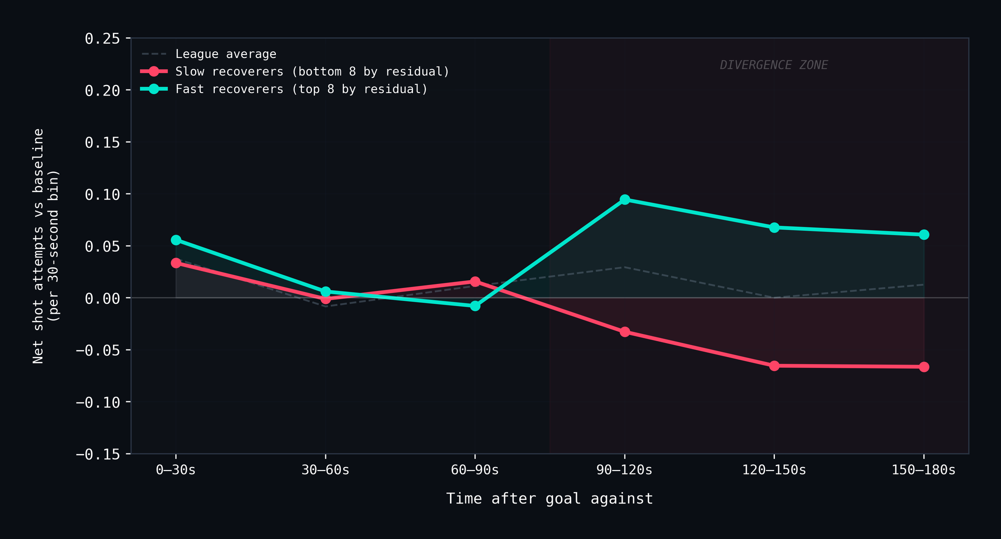
When you split teams into fast and slow recoverers — not by raw settling time, but by residual settling time after controlling for Corsi% (i.e., teams that recover faster or slower than their overall shot metrics predict) — the first 90 seconds of the recovery window are indistinguishable. Cohen's d = 0.00. p = 0.91. There is no measurable difference between fast and slow recoverers in the 0–90 second window.
Then the next 90 seconds diverge sharply.
In the 90–180 second window, fast recoverers maintain a positive shot attempt surplus of roughly +0.07 per 30-second bin. Slow recoverers collapse to −0.05. The gap is +0.11 shot attempts per bin, and it's highly significant (Cohen's d = 0.174, p < 0.0001). This survives cluster-robust standard errors at the team level (p = 0.0007 in a mixed model with team random intercepts), and a continuous regression replacing the binned fast/slow classification confirms the pattern is not a threshold artifact: the relationship between recovery speed and late-window performance is smooth and linear (r = −0.70 across team-seasons, no significant quadratic term).
This pattern (i.e., silence followed by divergence) is not something aggregate metrics can detect. Corsi% sees the whole 60 minutes. Shot maps see location distributions. Neither captures the temporal structure within a three-minute window.
Several robustness checks confirm this is a real feature of the data, not an artifact of analytical choices. Context-matched baselines that adjust for score state (trailing vs. tied vs. leading) change the divergence by approximately 1% — the pattern is not a "teams that just fell behind shoot more" effect. A pseudo-perturbation control, sampling matched non-goal 180-second windows from the same teams, shows no fast/slow divergence at all (d = −0.015, p = 0.31). The late-window gap is specific to goals-against, not a general property of team quality in arbitrary windows. And sensitivity testing across 25 combinations of inter-event gap (60–180s) and remaining-time (120–240s) thresholds shows significant divergence in 22 of 25 combinations, with the early-window placebo holding at 0/25.
The question becomes: what's actually happening in that late window?
The Mechanism
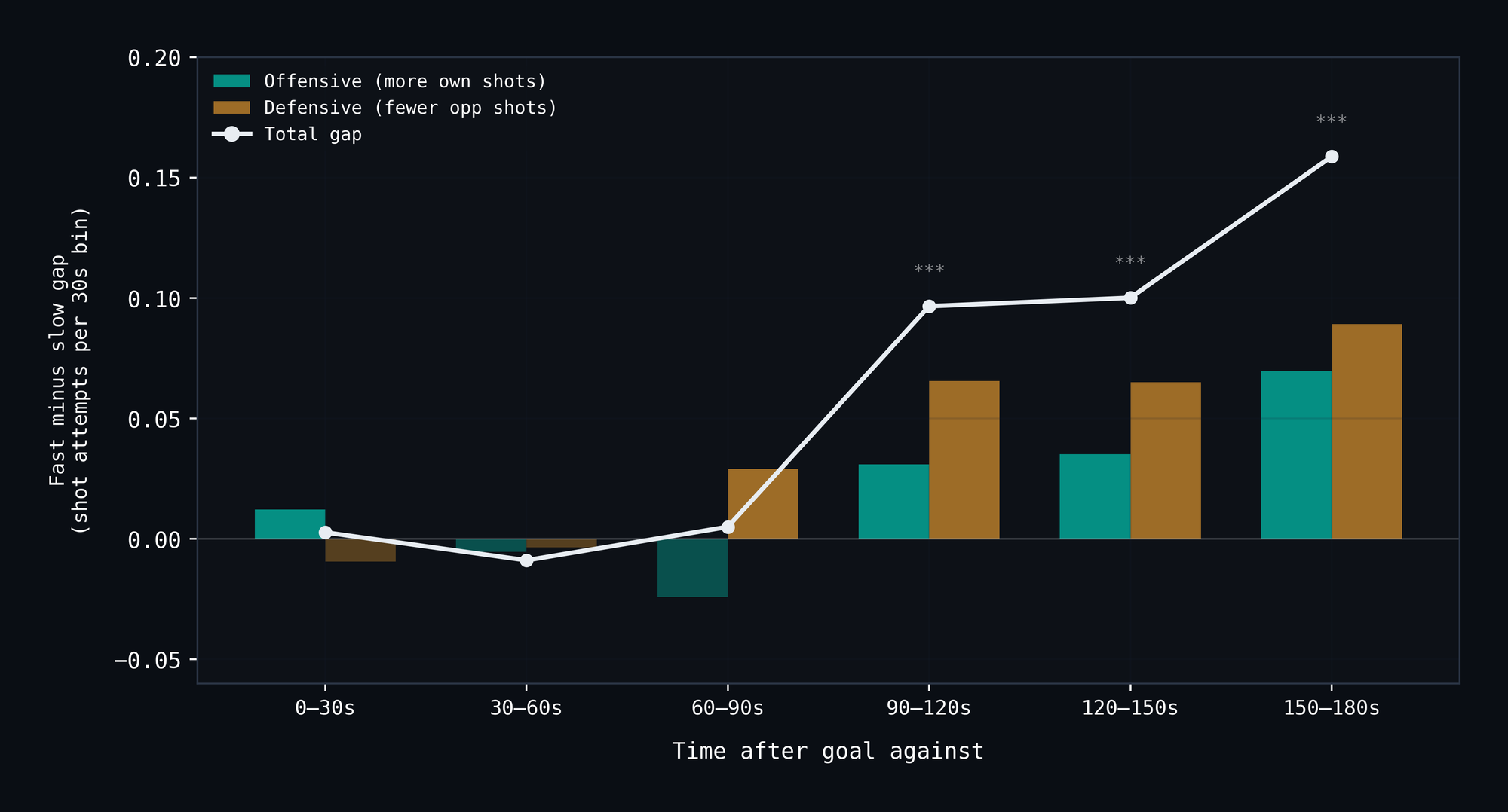
We went back to the raw shot data and decomposed the late-window gap into its offensive and defensive components. Is it that fast recoverers generate more offense, or that they suppress the opponent's offense? And what does the opponent's shot quality look like?
The answer is both, but the defensive side is bigger.
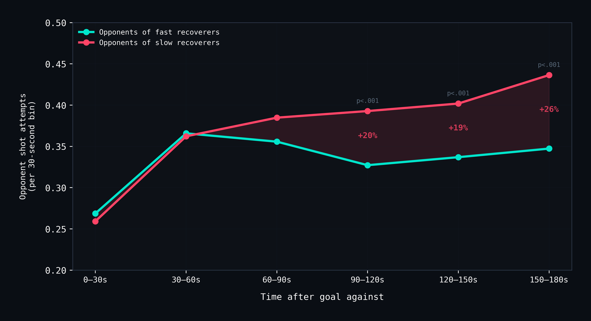
In the 90–180 second window, approximately 60% of the xG gap comes from the defensive side. Opponents of slow recoverers generate 20–26% more shot attempts in the late window than opponents of fast recoverers. That's not a subtle difference — it's a quarter more shots, sustained over 90 seconds.
Meanwhile, fast recoverers ramp their own offensive output to 0.444 shot attempts per 30-second bin in the final segment, while slow recoverers flatline at 0.374 — an 18.6% gap (p < 0.001).
The mechanism is a two-sided failure: slow recoverers simultaneously produce less offense and leak more defense in the late window. And the defensive leakage is the dominant component.
One additional detail: fast recoverers' shooters have approximately 1.5 seconds higher average time-on-ice in the late window than slow recoverers' shooters. This suggests a coaching deployment signal — teams that recover well are keeping their top players on the ice longer after disruption, rather than rolling through their lineup. Whether that's a cause or an effect of better recovery is an open question.
What This Is Actually Worth
Here is the part where I tell you the honest answer about practical impact.
The total xG gap between fast and slow recoverers across the full 180-second window is +0.030 xG per episode. Fast recoverers net +0.022 xG per episode; slow recoverers net −0.008. Over a full season, with roughly 129 perturbation episodes per team, that gap accumulates to approximately 3.9 xG.
Four expected goals. Across an entire 82-game season. That's the total cumulative cost of slow recovery.
For context, the difference between the best and worst xG differential teams in the NHL is around 70 xG. A 4 xG gap is about 6% of that spread. It is a real effect, statistically. It is not a meaningful one, practically. You would struggle to find a single game outcome across an entire season that turned on the recovery dynamics measured here.
I'm stating this directly because I think sports analytics has a tendency to dress up small effects in dramatic frameworks. The control-engineering language is fun. The divergence pattern is genuinely interesting. But if someone asks "does this matter for winning hockey games?" — the honest answer is barely.
What Doesn't Persist
There's one more limitation that needs to be stated clearly: recovery character doesn't persist across seasons. The year-over-year correlation of Corsi%-adjusted recovery residuals is approximately r = 0.08. Essentially zero.
This means that being a "fast recoverer" in 2023–24 tells you almost nothing about whether you'll be a fast recoverer in 2024–25. The property isn't stable. It's probably driven by specific roster combinations, specific coaching deployment patterns, and specific game contexts that change from year to year. Carolina's raw settling time is consistently fast across all three seasons — but that's because Carolina is consistently excellent at Corsi%. Once you control for overall quality, the residual doesn't stick.
An alternative threshold-free metric — the integrated area of deviation in the late window — shows modestly better year-over-year stability (r = 0.19 vs 0.08 for settling time), but neither qualifies as a persistent trait. This fundamentally limits what the framework can be used for. It's not a scouting tool. It's not a predictive model. It's a descriptive lens that reveals interesting structure in how individual team-seasons process disruption.
What Survives
Here's what I think is genuinely worth taking away:
The temporal structure exists. The 90-second silence followed by late-window divergence is a real pattern in the data that aggregate shot metrics cannot capture. It survives cluster-robust inference, continuous modeling, context-matched baselines, pseudo-perturbation controls, threshold sensitivity testing, and truncated-episode analysis. The mechanism is identifiable: it's primarily defensive, driven by the opponent's ability to sustain pressure in the late window against teams that can't hold structure.
The score-state split is also interesting. The recovery trajectory differs meaningfully depending on whether a team goes from tied to trailing, leading to tied, or trailing to further behind.
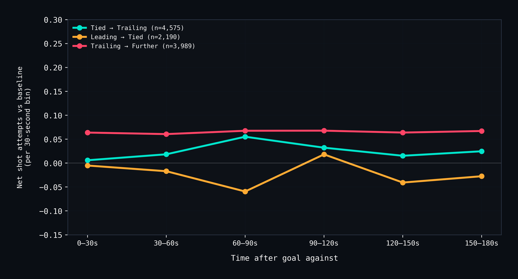
Teams that fall from a lead to tied show the most suppressed recovery, while teams that fall further behind show the strongest forward push. This is consistent with game theory: losing a lead is psychologically different from falling further into a deficit, and the shot patterns in the recovery window reflect that.
But the bottom line is that the Restoring Force is a way to see something that was previously invisible, the temporal shape of how teams process disruption, without pretending that what it sees is more consequential than it is. It's a descriptive framework that reveals roughly four expected goals of value across an entire season. That's the truth of it.
If that framework ever becomes more interesting, it'll be in the context of short tournaments (e.g., Olympics, World Championships) where sample sizes are small, stakes are higher, and recovery dynamics might matter proportionally more because teams haven't built the kind of structural depth that smooths things out over 82 games. That's a future project, and one that requires data I don't currently have.
For now, teams push forward after being scored on. Good teams push forward more. And the interesting part isn't the push — it's the 90 seconds of silence before some teams sustain it and others don't.
Data: MoneyPuck.com shot-level files, 2022–23 through 2024–25 (340,989 events, 3,936 games). Analysis restricted to 5v5 regular-season play. Perturbation events: goals against (non-empty-net) with ≥120 seconds between events and ≥180 seconds remaining before period end. Recovery window: 180 seconds post-goal, in 30-second bins. Team baseline: season-average 5v5 net shot attempt rate per 180 seconds. Fast/slow classification: top/bottom 8 teams per season by settling-time residual (controlling for Corsi%). Mechanism decomposition: 74,856 team-bin records. Statistical tests: one-sample t-test (baseline comparison), Mann-Whitney U (bin-level fast vs slow), cluster-robust OLS and mixed models (team random intercepts), ANOVA with ICC estimates (within-team consistency), Pearson and partial correlations (team-level validation). Robustness: seven supplementary analyses including cluster-robust inference, continuous regression, AUC metrics, context-matched baselines, pseudo-perturbation control, threshold sensitivity (25 combinations), and truncated-episode bias testing.
The framework borrows terminology from control systems engineering — specifically the concepts of step response, settling time, and damping ratio. The analogy is structural, not mathematical: we are not fitting transfer functions to hockey data. The term "restoring force" refers to the tendency of a system to return to equilibrium after perturbation.
Contact: info@beyondthemetric.ca